In this tutorial, you are going to learn how to add a border around a button in Flutter. For this tutorial, we’ll be focusing on the RaisedButton class in Flutter and editing its properties.
RaisedButton
RaisedButton widget in Flutter creates Material-specific buttons.
It provides two required parameters, onPressed and child, where onPressed takes a function (i.e. what happens when the button is pressed) and child can take any Widget.
This is how you can use a RaisedButton:
RaisedButton(
            onPressed: () {},
            child: const Text(
              'Press Me',
              style: TextStyle(fontSize: 20),
            ),
          ),
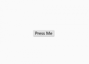
If you run the above code snipper in your Flutter mobile app, it will render a button that looks like the one on the image below.
Some Basic Customization
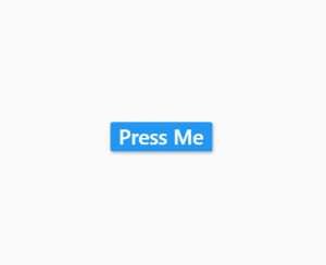
The RaisedButton widget is highly customizable. Let’s give the text a white color and the button a blue color.
RaisedButton(
            color: Colors.blue,
            textColor: Colors.white,
            onPressed: () {},
            child: const Text(
              'Press Me',
              style: TextStyle(fontSize: 20),
            ),
          ),
The above code snippet will render a button that looks like the one in the image below.
Adding a Border
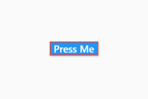
To add a border around a button, we can customize the button’s shape property.
The shape requires a RoundedRectangleBorder property.
RoundedRectangleBorder further requires a side property and an optional borderRadius property set.
In the below code example we have configured the RoundedRectangleBorder with a solid border of the color red and a width of 2 pixels.
RaisedButton(
            color: Colors.blue,
            textColor: Colors.white,
            shape: RoundedRectangleBorder(
              side: BorderSide(color: Colors.red, width: 2),
            ),
            onPressed: () {},
            child: const Text(
              'Press Me',
              style: TextStyle(fontSize: 20),
            ),
          ),
The above code snippet will render a button that looks like the one on the image below.
Rounded Border
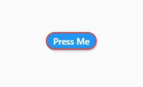
Flutter has a shape class called StadiumBorder, which outputs a rounded button.
You can use the StadiumBorder in the exact same way as a RounedRectangleBorder.
RaisedButton(
            color: Colors.blue,
            textColor: Colors.white,
            shape: StadiumBorder(
              side: BorderSide(color: Colors.red, width: 2),
            ),
            onPressed: () {},
            child: const Text('Press Me'),
          ),
The above code snippet will make your button look like a button on the image below.
I hope this Flutter tutorial was helpful for you. If you are interested in learning Flutter, please check other Flutter tutorials on this site. Some of them have video tutorials included.
Happy mobile app development with Flutter 🙂!